THE PROBLEM
Students’ declining attention span
The rise of social media, particularly short-form content, has contributed to students' declining attention spans.
Students frequently report difficulty focusing on assignments or studying for tests without getting distracted.
In this case study, I aimed to help students improve their focus while working.
ROLE : UI/UX Designer TOOLS: Figma, Photoshop DURATION: July 2023 - September 2023
THE SOLUTION
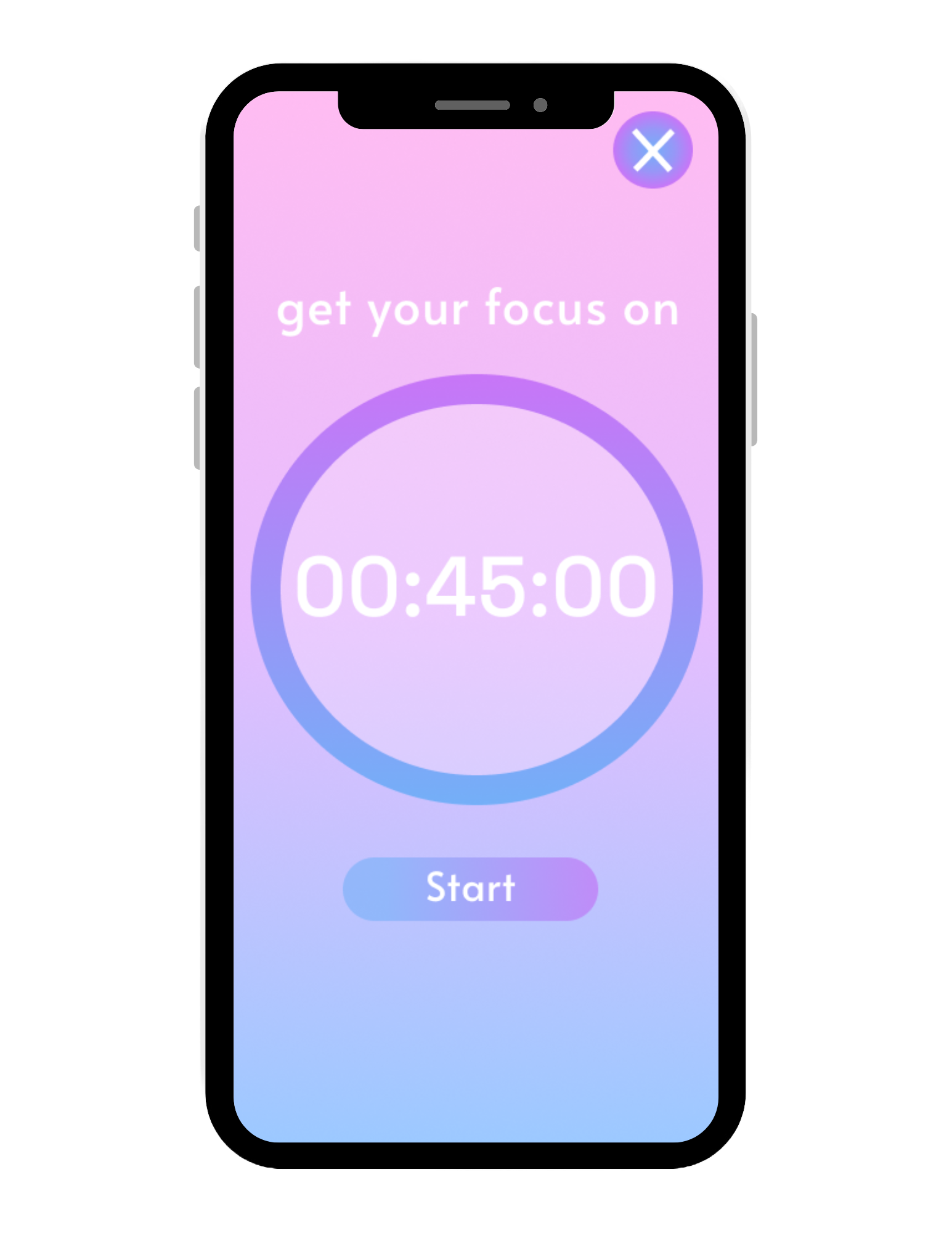

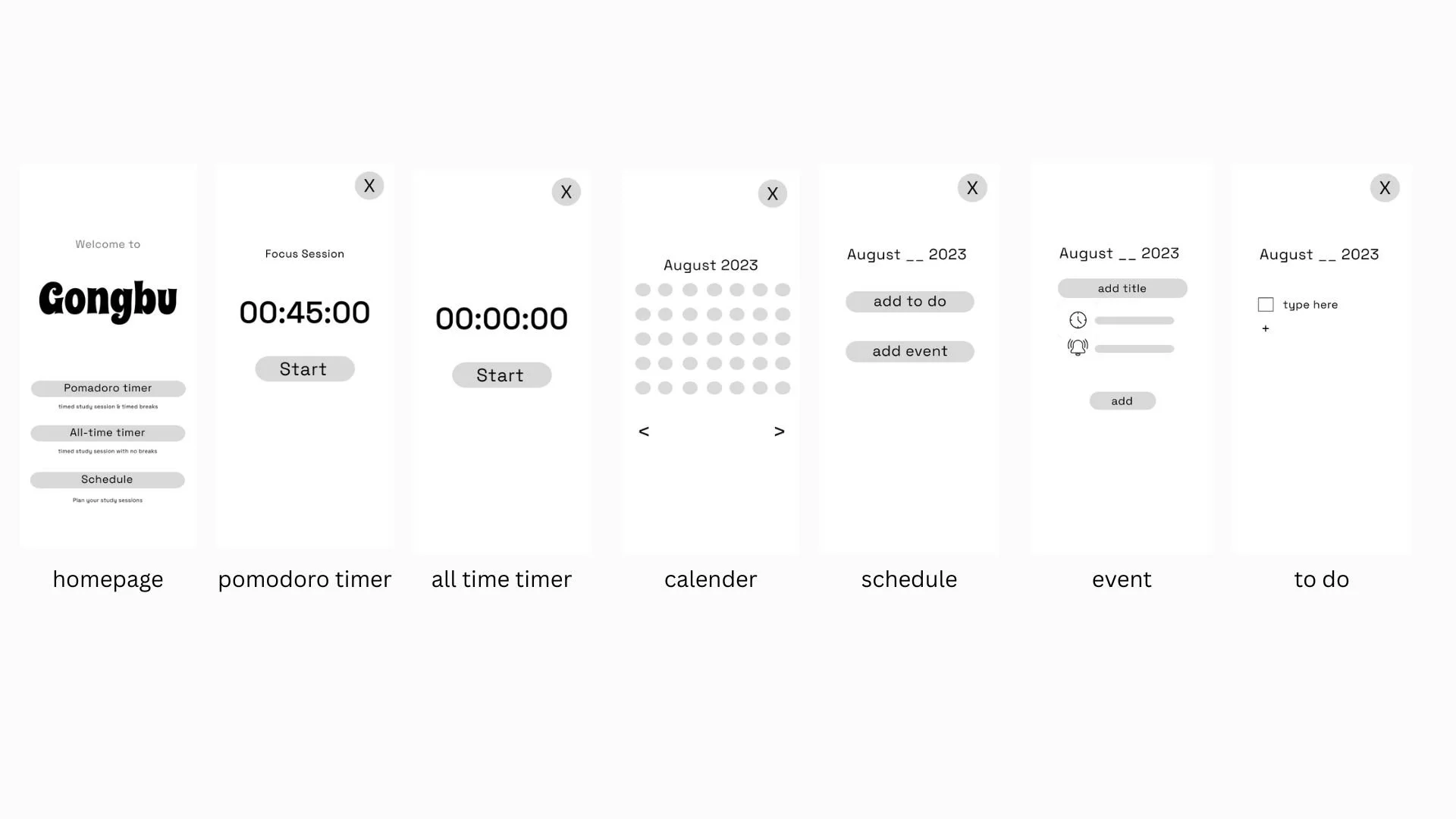
Pomodoro Timer
Pomodoro timer helps increase focus and concentration by giving the users a 45 minute work session along side a 5 minute break.
All-Time Timer
All-Time Timer helps track how work sessions while motivating those to keep their goals.
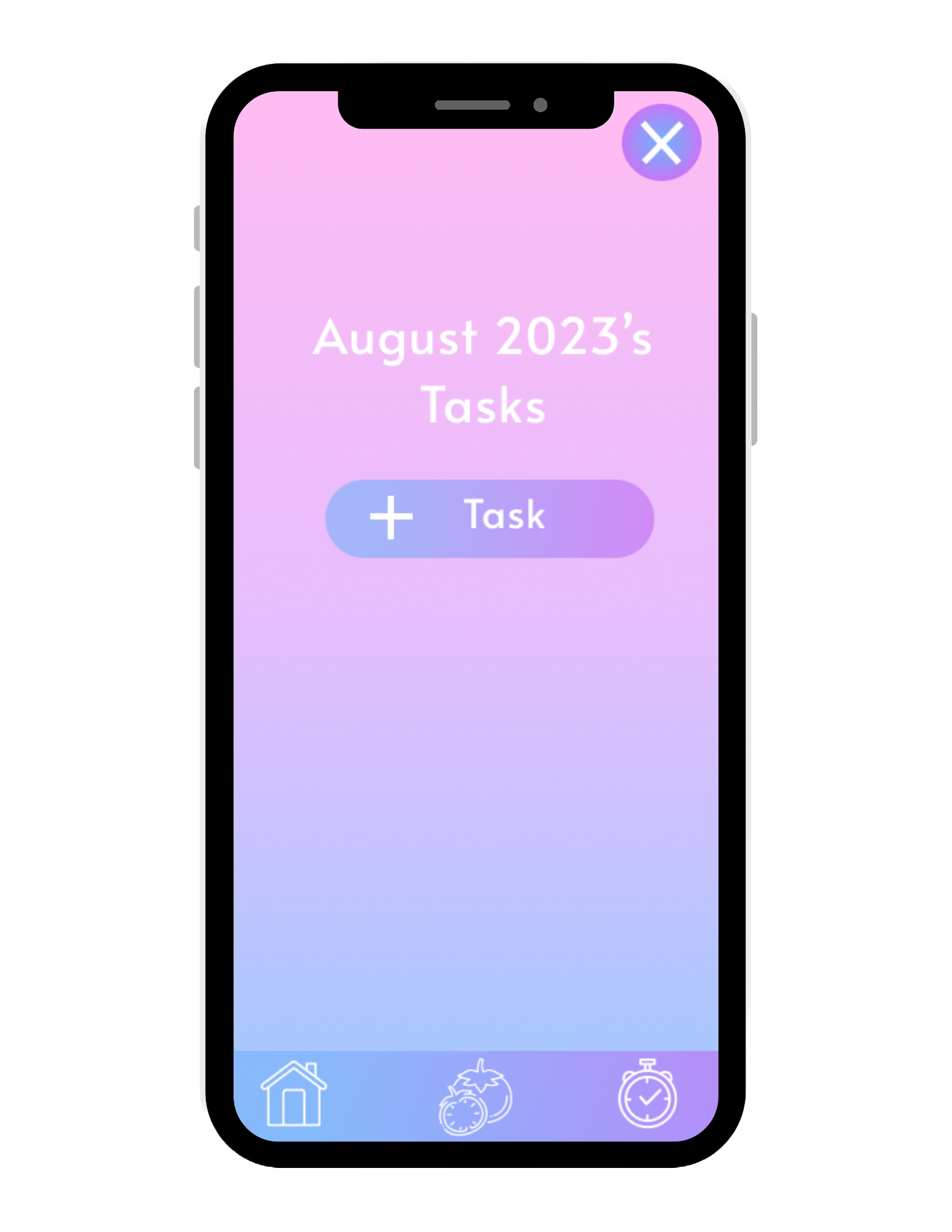
Task List
Planning out tasks helps users organize their work while reducing the chances of procrastination.
Design Process Overview

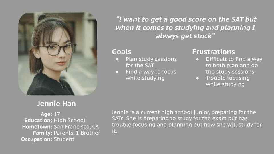
01 RESEARCH
User Personas and Journey Maps
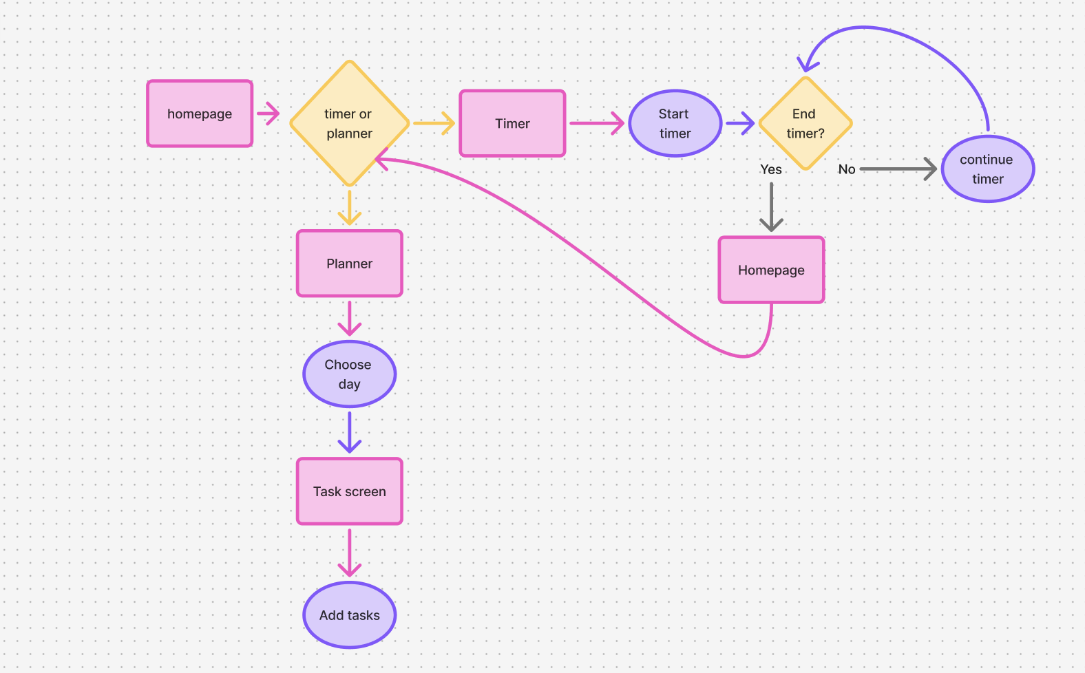
02 IDEATION
User Flow
04 DESIGN
Low Fidelity
05 FINAL DESIGN
Incorporated a short working timer into the prototype
Feedback Iterations

High Fidelity Mock-Ups

High Fidelity Overview
06 REFLECTION

As this was my first UX project, I learned about the UX design process through user journey mapping, user flows, low- and high-fidelity prototyping, and usability testing. My biggest takeaway was that users value simplicity over abundant features. Initially, I created an interface with many features, but users found it confusing and preferred something simple and easy to use. In the future, I'd like to add group study sessions where users can connect with others who are studying to build a community. Overall, this case study taught me not only about the UX design process but also the importance of simplicity over feature maximization.


04 TESTING
Usability Testing
Participant’s Tasks
Go to the Pomodoro page and start and stop the timer
Go to the All Time Timer page and start and stop the timer
Go to the Plan page and create a plan
Go back to the home screen
All participants felt that the non-working timer function in the prototype was disorienting and confusing.
2/3 participants emphasized their confusion with the app's calendar function. They did not know how to put in events or tasks and found the layout to be confusing.
1/3 participant emphasized their difficulty with reading the font.
Findings
Methodology
Conducted through Google Forms
Unmoderated usability study
Participant Requirements
Must be a current student (high school, college)
Have experience using planning and study timer apps
Simplified planning to just a task list for less confusion
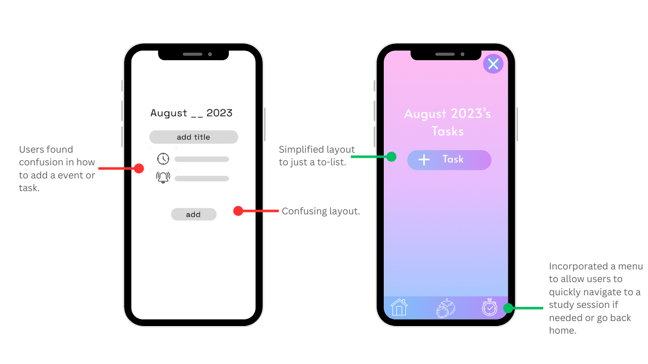
Increased the font size and added logos for accessibility
